Thursday, April 17, 2014

Ebook Cover

4-17-14

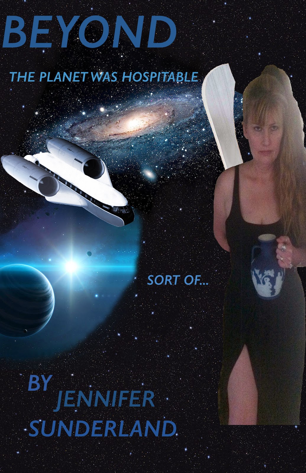
     One of my goals for my Photo Shop class was for me to be able to make a book cover for an ebook. When someone signs on to look at your ebook, all they see is the cover.

     I wrote a space ship story, last summer, and I wanted a cover for it.

     I used the concept for my Movie Poster assignment. To make a book cover, I removed the movie credits, and added "By ...."  

     The trickiest part was the size. I figured out how to go into "Image" and change the image size. Very fun.

     Anybody can go to barnesandnoble.com and put "Jennifer Sunderland" into the search.  My Nook Book "Beyond" will pop up for $2.99.

     The name will update to "Beyond: Change Your Fish" within 24 hours. I just realized that there are 1,200 books called "Beyond" on Barnes and Noble.

     Here it is...

Friday, April 11, 2014

Movie Poster Assignment

4-11-14

     Our latest assignment was a big Movie Poster. It utilized many of the skills we've been learning.

     I had to make many different layers with masks for coloring and shading. I did some fading and matching. I used the "Credit" writing that I discussed in the last post.

     It was fun, and the finished project reflects all the work I put into it.


Thursday, April 10, 2014

"Vector Me Up, Scottie."

4-10-14

     This week, Lee taught us about Vectoring. Vectoring is about drawing lines in Photoshop. It's very similar to Adobe Illustrator.

     I didn't save the exercise we did in class, but because Lee gave us knowledge, I was able to do it again.

     Vectoring is done with the Pen Tool. It looks like an old fashioned pen that you would dip in ink. Do not put ink on your computer.

     We uploaded an image of a Logo from the internet. Then we traced over it, with the Pen Tool.

     We learned how to select the Shape Layer Group and change colors. It was very fun.

     You start with a "click" dot and make another "click" dot. You move the handle of the dot around to shape your picture. Before you let go, press Alt and bring your handle back in and tuck it around the edge, so you can make tight corners. Make sure you complete your shape, before quitting.

     I made a twirly image very similar to the logo I selected, but with jazzier colors.  I deleted the layer with the original logo, to save only my new image.  Ta da!

Monday, April 7, 2014

Credit Where It's Due

4-7-14

     We learned a very cool feature in Photoshop where you can write "Credits" like the movie poster credits we see when we go to the movies.

     First, you get with Lee to save the Font "Steel Tongs" and save it on your flash drive.
     Then, you Open up something in Photoshop.
     Go to your flash and find "Steel Tongs". Open it. There are 2 Fonts and a text document.
     Open a font, click "Install". Open other font, click "Install".
    
     Open the text document. Copy the web address and paste in on your browser, thereby going to the site. It's a picture guide to what symbol to push for what movie credit.

     Cut your screen in half, so you can work on your Photoshop document and study the picture guide at the same time.

     You might push an apostrophe and get a credit "Story by", for example.

     If you don't find the word you are looking for, write it really small with your font size-selector.
     Of course, you do all this with the Type Tool in Photoshop, once you have chosen your font as "Steel Tongs".

     I made these credits for my Movie Poster Project.  Very official looking.


Color Crazy

4-7-2014

     I like to use a Mask on a Layer to change colors. I am very particular about colors. I want to get the exact shade and brightness, without looking opaque or blotchy.

     First, I Select the objects in the picture I want to change.
     Then, I Click on that Layer, in the Layer Panel.
     I go up to the Adjustment choices and click on the one that looks like a bunch of squares, on the left, second row down. That's the Hue/Saturation.

     A panel will pop out. You have to click the square on the bottom, with bent arrow sticking out of it. That will allow you to change the color of your object, without affecting the whole picture.

     Put a check mark in the box that says Colorize.

     Now you can play with the sliders that change the Lightness, Saturation, & Hue, to your heart's content.

     If you leave the panel, to do something else, and you want to come back to it: Click on your Layer, click on the square with the brackets around it (double click it if you have to, to get it's attention), then (still on your desired Layer) click on the round thing with the brackets around it, on the left side of your Layer (not the eye). This will make your color panel pop out again, so you can play with it some more.  Very fun!

Sunday, March 30, 2014

Under-Eye Circle Video

3-29-14

     I was curious about this video, because it seemed like a different way to use the Stamp Tool. I carefully studied the differences.

     It looks more like a Soft Brush Tool than a "Stamp". It's used for removing under-eye circles, pimples, and neck-lines (all useful things).

    The trick seems to be to go to the "Mode" of the Clone Stamp and change it to "Lighten". You have to change the Opacity lower, to 20%, to make the effect gradual & invisible.

     The recommended brush is big, soft, and round. You start by choosing a stamp from a light area. That's where the similarity to stamping stops. From then on, you hold the stamp down and "sweep" it over the area you want lightened.

     I took my original picture of Mary, and swept around her right eye. I didn't touch the left eye. The circles under the eye immediately disappeared.

     The affect was subtle,... too subtle. The rest of her face wasn't smoothing out with such a light touch. I swept all around her eye and her cheek. Directly below the eye looked good, but above the eye looked untouched.

     I got so bored with the lack of change that I had to stop. I did the right thing using the full Opacity "Stamp" when I did the homework project. I was looking for an alternative. This isn't it.

https://www.youtube.com/watch?v=Ib32GXYxeHQ

     Look at just the right eye that I did.


Thursday, March 20, 2014

Stamping Video

3-20-2014

     I love the Clone Stamp,...  love, love, love.  I even changed the name. I call it the Stamping Tool.

     I love hair, so I use it to make hair.

     I found a video that's not too advanced. Some of them were pretty complex. I might go back and do something on the one that removes dark circles under the eyes (God knows we need that).

https://www.youtube.com/watch?v=ybuOwk0a3jU

     I'm giving an example of how I use the Stamping Tool to make crazy hair. If you notice, her hair is now bigger than the original picture.  Bam!

Wednesday, March 19, 2014

Quick Selection Tool Video

3-19-2014
  
     I was having trouble following most of the PhotoShop videos, because they were too complicated.

     I wanted to get more familiar with the Quick Selection Tool.  Many people use the Quick Selection Tool, because it's fast & easy.

     I found this Easy-to-Understand video:  https://www.youtube.com/watch?v=Mns8sSqkbJE

     I used it to select the lady's dress and change it to Blue, because I like blue better than red.  After I had it selected, I did a Hue/Saturation Adjustment Layer. It worked very well.

     Yes, I was very proud of myself.


Saturday, March 15, 2014

Lee's Email About Photoshop Assignment

3-15-2014

     I just read Lee's email about our assignments. She wants them posted on our blog.
I actually posted my Kitty-bunny down on 2-28-14.
     I posted my "Model" photo above that, still on 2-28-14.
I posted my "Zombie" assignment on 3-8-14.
     I will really miss everybody making silly comments, in class, about all the assignements. I will have to look up and see what everybody did.
     Mary really loved her "Zombie" photo. She had me print it up, and she's going to show all her friends when she goes visiting.


Saturday, March 8, 2014

MacBook iPhoto Retouch

3-8-2014

     I was talking to my teachers Lee and Jayna, and I told them about a feature I found on my 7 year old MacBook.
  
     I was in the hospital, visiting my Dad after heart surgery last Summer. I had him take my picture. I realized there was lady sitting behind me that I didn't even know. We went to the reception room and took another picture. The dark wood paneling cast a dark shadow over my face.

     I liked the original picture best. I was facing the window, and there were no shadows. In addition to the strange lady behind me, I also didn't like the wrinkle lines on my neck. There was also a crooked calendar on the wall, overshadowing my ear.

     I plugged my camera into my MacBook and got into iPhoto. I went to "Edit". I hit "Retouch" which has a picture of a paintbrush. It has instructions, "Drag over the affected area."

     I dragged the paint brush over the lady behind me, and she blurred into the wallpaper. I dragged over the rumpled sheets, and they blended into the bedspread. I "brushed" away the calendar, and it blended into the wallpaper. I "brushed" over the lines on my neck, and they disappeared (happy day!).

     I was able to go back and forth between different tries, but once I saved it and left "Edit" I couldn't get the original back. Now, even if I plug in the camera, I can't get the original picture back. iPhoto adjusts it every time.

     So... now I have the edited version, but not the original.


Zombie Mary

3-8-2014

      The next part of our PhotoShop assignment was to make our "model" into a zombie.

      I imported 2 skulls, 3 sets of teeth, an eye, a brain , and 3 sets of flames. I got a little carried away with the blood. I had to cut-out away from her hair, because blood was all over the room. When I went to give her more hair, I had cut it away. At Lee's suggestion, I imported more hair. Then I couldn't find it. I put the hair under her face, but I found the layer at the very top, the last layer of flame I put in. I brushed away the flame, and there was the hair. At last!

Sunday, March 2, 2014

Drawing Project

3-2-2014

     The next assignment we have in Art class is to draw a picture of ourselves. In the first Graphic Communications class I took, we learned that tracing can be an important tool to getting your image onto the computer, as in the use of Illustrator.

     For this assignment, the first part was to trace an image of ourselves, onto plastic, in the mirror.
     I was so fascinated by the result, that I took a picture of it.
    
     Does it look like me?  You decide...

Mechanic Painting

3-2-2014

     My friend has a painting that has become very symbolic to me. It reminds me of an assignment we had in the Art class that is part of the Graphic Communications degree. We had to make a collage. It involved cutting out shapes and pasting them to a picture. The result had a 3 dimensional affect.

     This painting actually has cut out shapes pasted onto it. It has a 3-dimensional look. He does alot of inventing of mechanical, metal things. When I look at the painting, I see metal, pieces fitted together, and even rivets.

     He bought this painting at a furniture store in LA, on sale for $75, in 1993. It's very similar to some of the techniques we learned in Art class. It shows that those skills have a market and can be enjoyed for years.

Friday, February 28, 2014

Mary McGee The Model

2-28-2104

     The next assignment in Photoshop was to take a picture and make it into a model.  I found the perfect model: a 76 year old lady that raced motorcycles in the desert. She has wrinkles.

     I became obsessed with keeping the basic shape of her face. I didn't want to smooth her cheek-bones or remove her smile. I kept some shading around her eyes but removed the dark circles.

     I had to transplant some jaw. When I smoothed out the side of her face, I messed up her edge. I added some hair (even though I think her hair is very nice). Her face looks a little wider, but I was happy with the result. It still looks like Mary.


2-28-2014

     As I've said before, part of the Graphic Communications Degree is to take an actual Art class. It teaches the basics of the Art Language.

     This week, we made "Print Plates", applied ink, and printed them up. We actually, physically, padded them and rolled them through a roller. It seemed like ancient technology. There was a time when this was the latest technology, in Gutenberg's time. Jayna Conkey touched on the history of Typography in the first Graphic Communications class.

     We were all in suspense to see what our prints would look like, when they got unwrapped after the roller. It was all very cool.
    
    This girl made a whale. It accidentally came out very good. We were all very impressed. She used gauze to make ripples in the water. Fascinating.
     It's interesting how sometimes your own work is not favorite result. Mine are the 3 in the top, right corner. The top one was too dark. I hated it. I did another one, with the same plate (below it) and the color (light and dark) was more balanced. I still didn't love it. You couldn't see the flowers. Oh well.

     I used another plate to make a single flower bush, in a frame (to the left of the corner). It was too light. I think printing leaves is hard, because they dry out and don't make a shape.

     One student printed cars (left side of picture). They looked perfect, like a photo. He said he traced them.

     My favorite print had images of birds (but not too perfect) and had a nice balance of light and dark.
     This is it: my fave!   Not my work, just my favorite.


2-28-2014

     I really liked the next assignment in Photoshop. It was combining 2 animals (into 1 animal, get it?). I really like irony, so I wanted to make a cat with a tiger head on it.
I liked it,but it was unimpressive.
    It just looked like a tiger.  
I decided to make a bunny with a kitty head.
     I think it's really cute, and it was really fun. I think I learned something from the exercise. I had to make layers and change the opacity to blend it in.

Sunday, February 16, 2014

Altered Art

2-16-2014

     The "Altered Art" assignment was about taking an old painting and adding modern elements to it. I didn't want to add flying pigs to a masterpiece. I wanted the end result to be appealing.

     I started out wanting to take a woman sitting with cherubs, and put diapers on the cherubs. I couldn't find cloth diaper images large enough to work with.


     I liked that picture, but I found another painting that I liked.


     I wanted to fix up her hair and put a sexy choker on her. I had to include 5 items for the assignment, so I threw an iPhone in the background.

     I worked really hard on it and was happy with the result.


Restored Photo

2-16-14

     One of our assignments for PhotoShop class was to restore an old or damaged photo.

     I took a photo of my son and his family, copied it, put pen marks all over it, and punched holes in it. The assignment was to remove all the marks and make it look new.

     The PhotoShop worked very well. I had to use the "stamp" alot. The "band-aid" didn't work very well. I had alot of different textures, like the mesh of the rail. The end result looked exactly like when I started, before the damage.


Veggie Head

2-16-14

     I really enjoyed doing the "Veggie Head" exercise. It involves learning basic skills like: moving objects around the page, sizing, and duplicating.

     I wanted my Veggie Head to look like a girl. I thought the hair was really important. I erased the edges of the bananas to make them look soft. I was really happy with the result.

     When we saw the work of the whole class, I was impressed by the variety. I saw a girl-head. Other people produced work that looked angry or scary.


Friday, February 14, 2014

Masterpiece

2-14-2014

     I'm fascinated with this piece. It never gets old.
     It looks like someone threw paint on the wall, but it's actually quite balanced. It has light and dark, high and low.  It's actually not on paper.  It's painted on cloth, hung somehow on the wall, without cracking the dried paint.
      I always feel like I've "discovered" it, when I walk by. I want to stop people in the hall, and say, "Look! Did you see this?"
     I like "messy" art, anyway. I saw a big tapestry one time in my dad's office that looked like someone threw string and paint on cardboard and hung it on the wall. It was as tall as the two-story entrance way.
     I think art is supposed to express "How you feel."  I guess that artist felt "messy" that day.  My dad said, "That's funny. I feel 'messy' today, too."


Different Branches

2-14-2014

     This isn't my class, but it's a good example of how each student interprets a project differently.
These branches are all the same assignment.
     Some of these are very sophisticated. Everyone comes with their own set of skills to the class.


Art Building

2-14-2014

     One of the interesting things about attending classes in the Art Building, is all the student art all over the walls.
     Some of it looks obviously amateurish, but some of it is very good. It stands to reason that some people that take Art classes might be artistic.


Same classes

2-14-2014

     This young chap is doing the same thing I am, taking the Art class and then hiking over to the High School to take the PhotoShop class, as part of a Graphics Communications Degree.
     We share a desk and make self-deprecating jokes about our work.


Art Class

February 14, 2014

     Taking PhotoShop this semester is part of the Graphic Communications degree. So far, it's really fun. I think everybody enjoyed making our Altered Art Project.
     Another part of the Graphic Communications Degree, is taking an Art class. It's a totally different universe from the outside world. Usually, people tell you, "Quit playing. Do your work."  In this class, the idea is, "Play with it. Be creative.
     I like my teacher, Miss Wagner. She looks "Artsy" to me, not that I know what that looks like.